
Brand Guideline and Assets
Logo
Clear space
There must always be sufficient space surrounding the logo to maintain its visual impact and avoid competition from other graphic elements.

Minimum Size
20px height for digital applications.
3mm height for print applications.

Usage
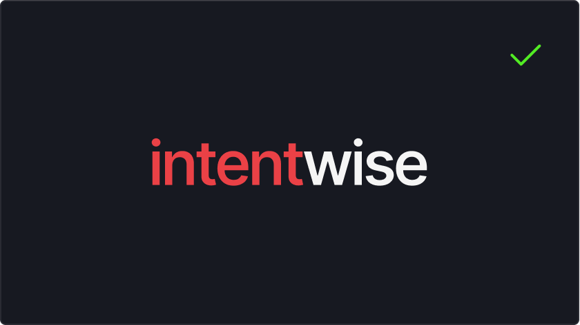
Intentwise dot above (i) and its color separation must always be as per the original mark.
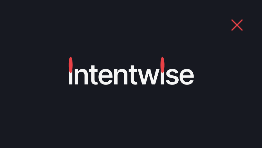
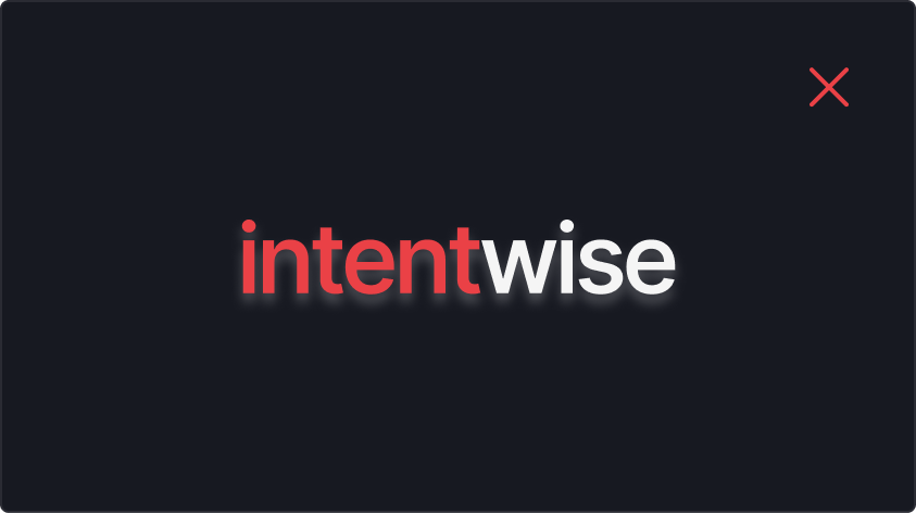
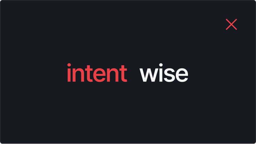
Our default logo is white with red elements. This should only ever appear on a dark background.
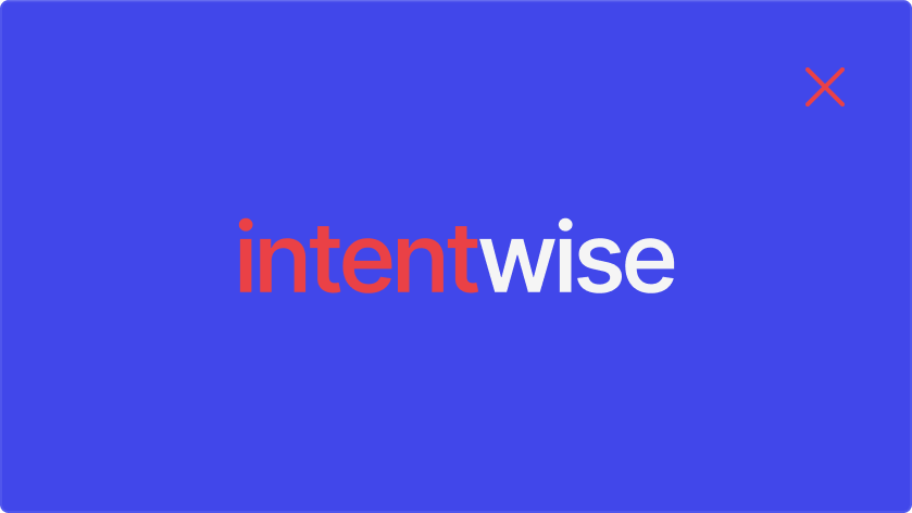
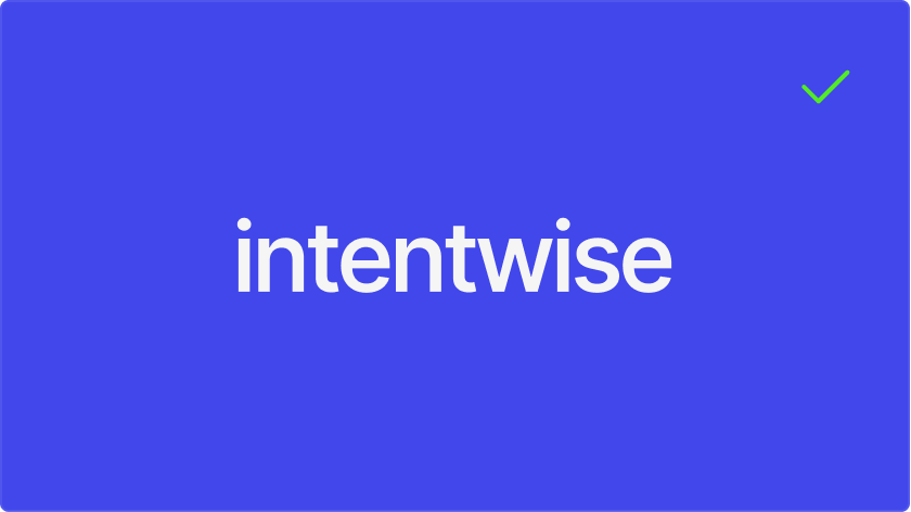
If the background color is not dark or white, please use an all-white or all-black logo. The red color should never appear on a background that’s not white or dark.
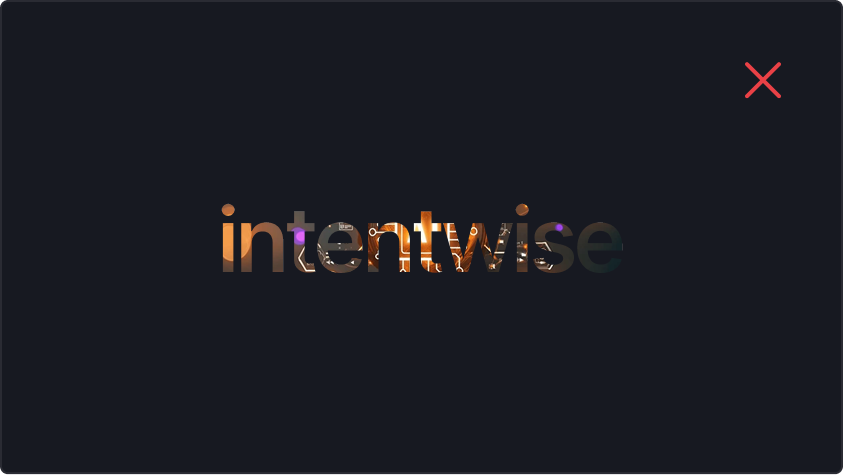
Don’t add effects to the logo — for example, shadows, gradients, or characters.
Don’t stretch or compress the logo.
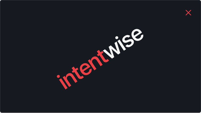
Don’t rotate the logo.
Don’t fill the logo or elements of the logo.
Don’t change the logo.
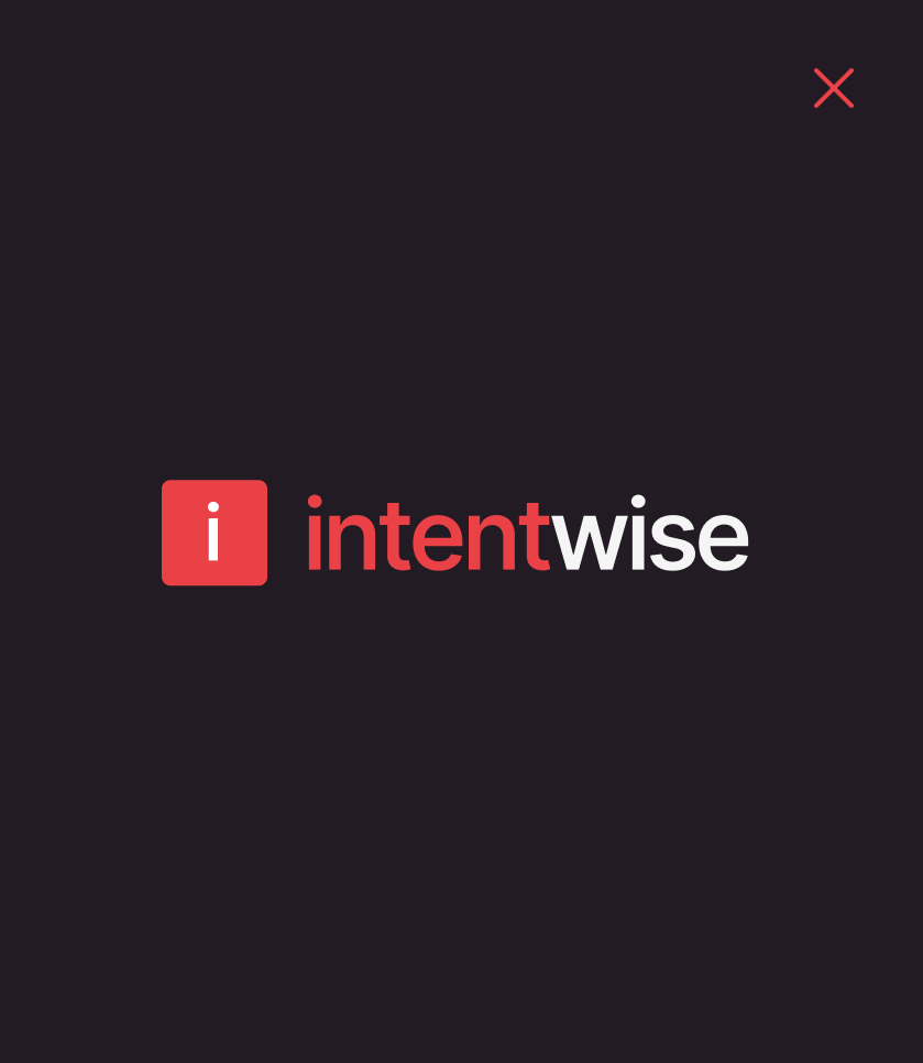
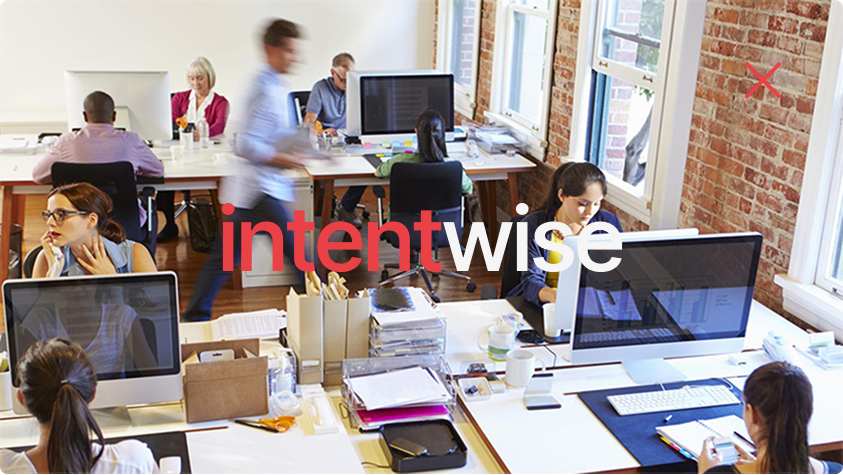
Don’t use the logo on busy backgrounds.
Logo placement on a page.


Our Mascot
Meet our mascot. Its role is to personify the spirit of Intentwise. Our mascot stands for automation, intelligence, knowledge, resourcefulness, and imagination.
Color palette
Primary color palette
Secondary color palette
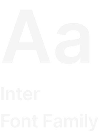
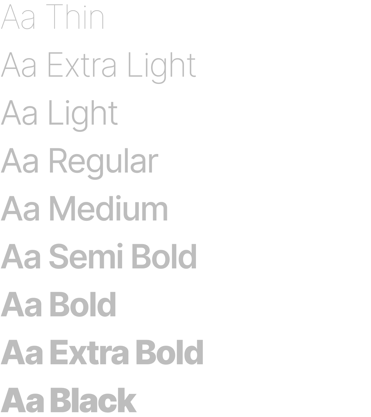
Typography
We wanted our font to be simple and beautiful. Inter represents our brand’s emphasis on simplicity and approachability.


