It’s a good year for brands that invest in Subscribe & Save on Amazon.
Amazon’s subscription service, which allows shoppers to receive discounted shipments of their favorite products at intervals of their choice, is already one of the lowest-churn subscription programs in e-commerce.
But for businesses that rely on Subscribe & Save, especially businesses that sell CPG products, understanding who those subscribers are and how long they stay subscribed has historically been a challenge.
Now, that’s starting to change. Last month, Amazon launched in beta a major upgrade to its Subscribe & Save data within the Brand Metrics dashboard. This new data is currently only available to select sellers and brands.
The revamped Subscribe & Save dashboard is a big deal. It answers, at a glance, a number of burning questions that businesses have long had about SnS.
Let’s dive into what the new Subscribe & Save dashboard can tell you—and what it can’t.
What data does the Subscribe & Save dashboard now offer?
Big picture: Amazon’s newly updated Subscribe & Save dashboard gives businesses, for the first time, a picture of the longevity of their subscriptions.
The SnS dashboard has all the usual metrics about the number of subscribers per product and an inventory forecast. But the real upgrades are about how long your subscribers are staying subscribed.
You can more easily answer questions like:
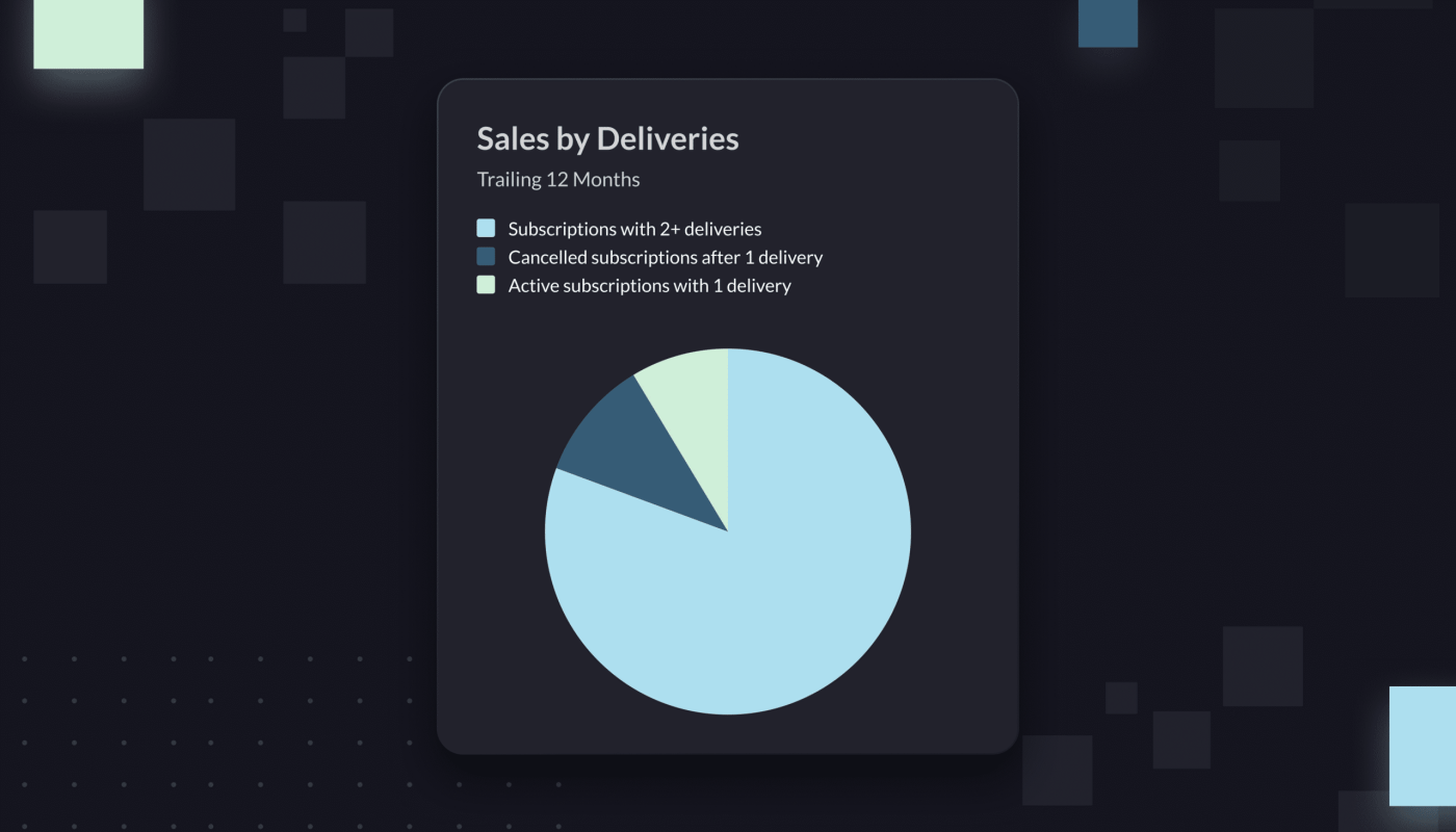
How many subscribers churn after their first purchase? Included in the SnS dashboard is a pie chart titled “Sales by Deliveries,” which breaks down subscriber behavior into three categories.
The first slice is the share of subscribers who have received 2+ deliveries from your brand, meaning they seem to be sticking around for the long-term. The second slice is the share of subscribers who received 1 delivery and have kept their subscriptions active. The third tells you how many canceled after that 1 delivery.
Ideally, the chunk of subscribers who have received 2+ deliveries will be the largest. If it’s not, you might have a problem.
This pie chart is particularly useful for quickly identifying if something is going wrong with your subscriptions. Ever wondered how many shoppers just take advantage of the coupon you offer to new subscribers, and then immediately cancel? Now you can find out.
If that share of subscribers who cancel after only one delivery is high, perhaps above 20%, then you might need to rethink your first-time subscriber coupon.
How long are shoppers staying subscribed? In the new Subscribe & Save dashboard, another graph shows “Subscriber Retention” broken down by percentage.
You can see the percent of subscribers who stayed subscribed for 30 days and the percentage of subscribers who stayed for 90 days. Are a lot of people dropping off between the 30- and 90-day mark?
How loyal are your subscribers? Generally, we assume that subscribers are going to buy more products from you than those who don’t subscribe.
It’s now easier to test this assumption: In the new dashboard, Amazon shows you how sales differ between subscribers and non-subscribers. This data only goes back 12 months, however.
What are the limits of the new Subscribe & Save dashboard?
These new data points are exciting, and they can certainly help a business owner that just wants a quick sense of what happens to their shoppers after they subscribe. But if you want to drill down into the nuances of SnS, you’ll run into some walls by using this dashboard alone.
For instance: Now it’s easy to see how many subscribers churn off your subscription within 2 deliveries. But if you want to understand subscriber behavior beyond those first 2 deliveries, you’re out of luck.
That means you can’t calculate the Life-Time Value of the typical subscriber, for example. You also can’t compare products based on subscriber longevity. If a certain product retains subscribers much longer than another, you won’t be able to see this in Amazon’s native SnS dashboard.
Similarly, it’s still incredibly hard to figure out how your subscribers are finding you. Is there a certain path that is most often associated with driving subscriptions? An ad—or set of ads—that seems to be especially effective at convincing people to subscribe?
Luckily, businesses that want to see this kind of granular subscriber data will probably be best served by Amazon Marketing Cloud. As we’ve discussed before, Amazon Marketing Cloud lets you map out shopper journeys: You can see all of the actions that a shopper took in the lead-up to an event, such as a subscription.
Because AMC now includes every SnS delivery as an event, the kinds of questions you can answer through AMC about Subscribe & Save are pretty much limitless. You can calculate exactly how many deliveries your typical subscriber receives before they cancel. You can also see how this varies by product.
Further, you can map out what turns a shopper into a subscriber. What ads are they seeing to convince them to subscribe? What kinds of terms are they searching? Have they bought from your brand before?
Basically: AMC is the place to go if you want to drive subscriber growth.
If you don’t just want to understand your subscribers, but also expand your audience of subscribers, then AMC is the place to go. For what it’s worth, if you do want to use AMC for SnS, we discuss how to do it in a lot more depth here.
And our team can help you build a sophisticated query, audience, or dashboard that lets you pull all of these granular SnS data points into one view. We’ve already helped a number of customers level up their understanding of SnS, or create DSP audiences that can tip customers over into subscribers.


